COLONIAL
PENNSYLVANIA
FARMSTEAD
ROLE
Artistic Director, Brand Strategy, Brand Development
SCOPE
Led a complete brand reimagining, refining the existing logo and designing a 50th anniversary celebration mark, alongside a new typography system and color palette. Developed comprehensive brand guidelines to ensure a cohesive visual identity across all digital, print, and environmental applications.
Adobe Illustrator, InDesign
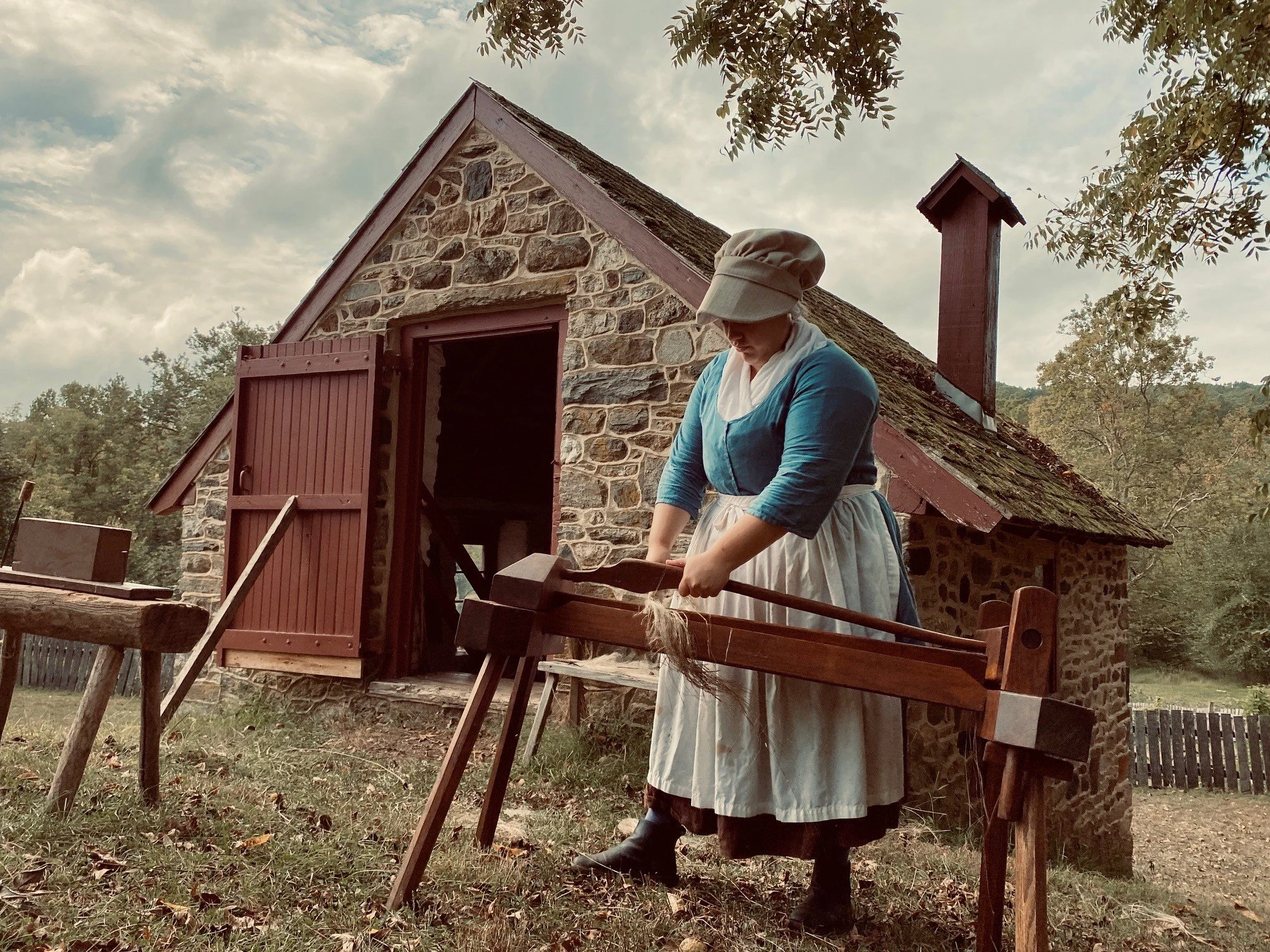
The Colonial Pennsylvania Farmstead’s mission is to educate, engage, and inspire visitors through hands-on, research-based experiences that bring the agricultural and domestic traditions of Revolutionary-era Pennsylvania to life, fostering a deeper understanding of early American history and the people who shaped it.
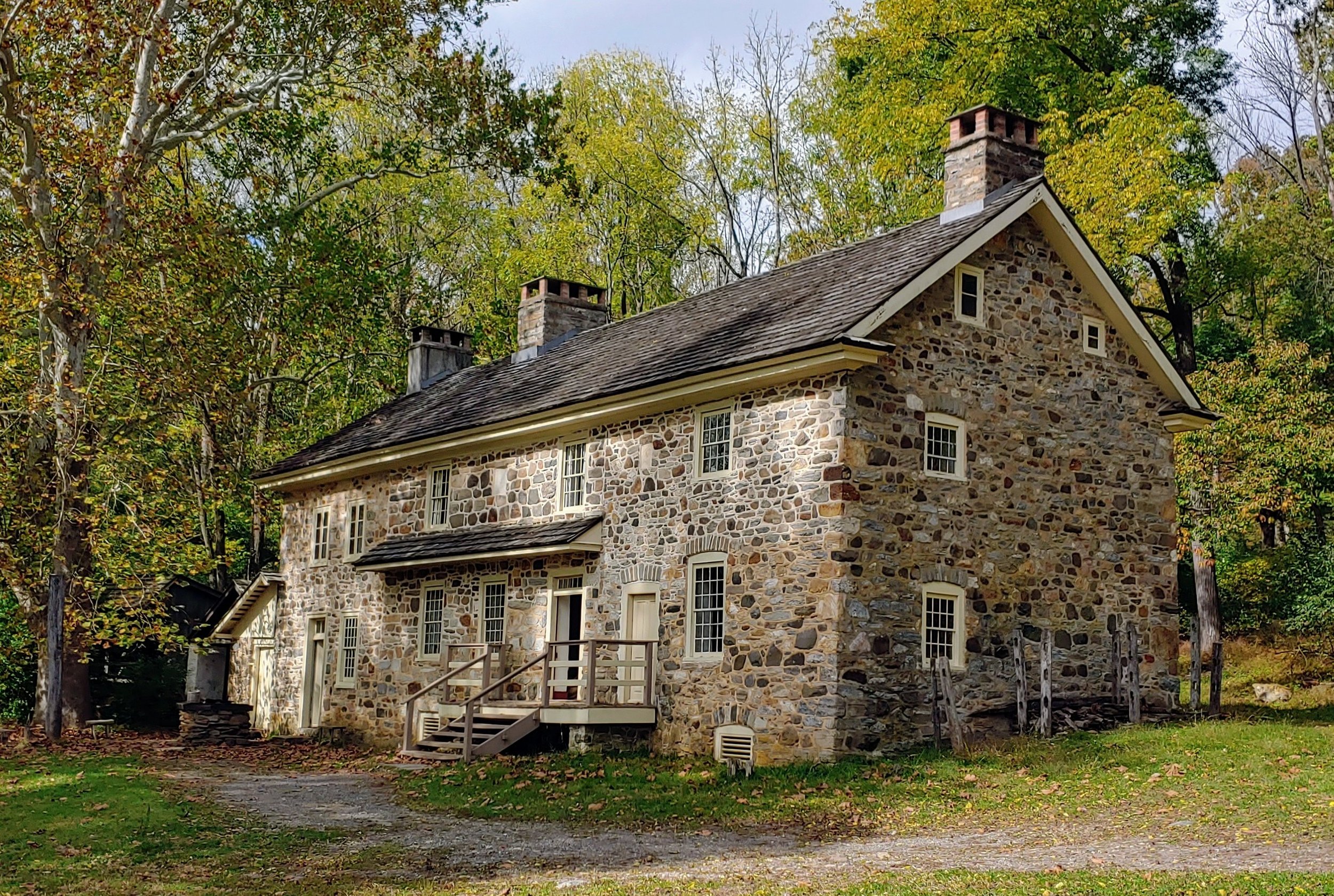
This nonprofit educational organization is situated on 112 acres within Ridley Creek State Park in Delaware County, Pennsylvania. Celebrating its 50th anniversary since it was declared a historical site, the farmstead operates as a living history farm, preserving and interpreting the agricultural and domestic heritage of early Pennsylvania.


PROCESS
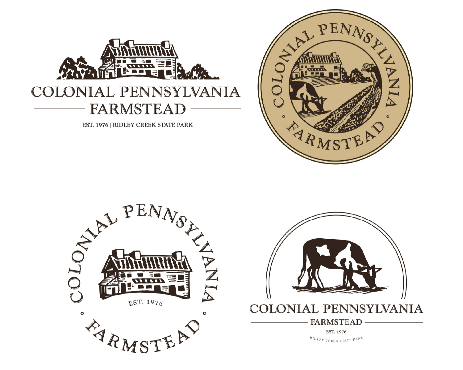
The logo exploration for Colonial Farmstead began with a focus on familiarity. At the client’s request, I first created four logo variations that built directly off the existing mark. These concepts were designed to modernize the logo while improving flexibility and ensuring the identity could expand and adapt across multiple mediums, from print applications to digital use.
After exploring those refined variations, I created four completely new logo concepts to explore what a more modern identity for Colonial Farmstead could become. These designs diverged from the existing logo and explored new visual directions, expanding the brand's possibilities while still honoring the farmstead’s purpose.
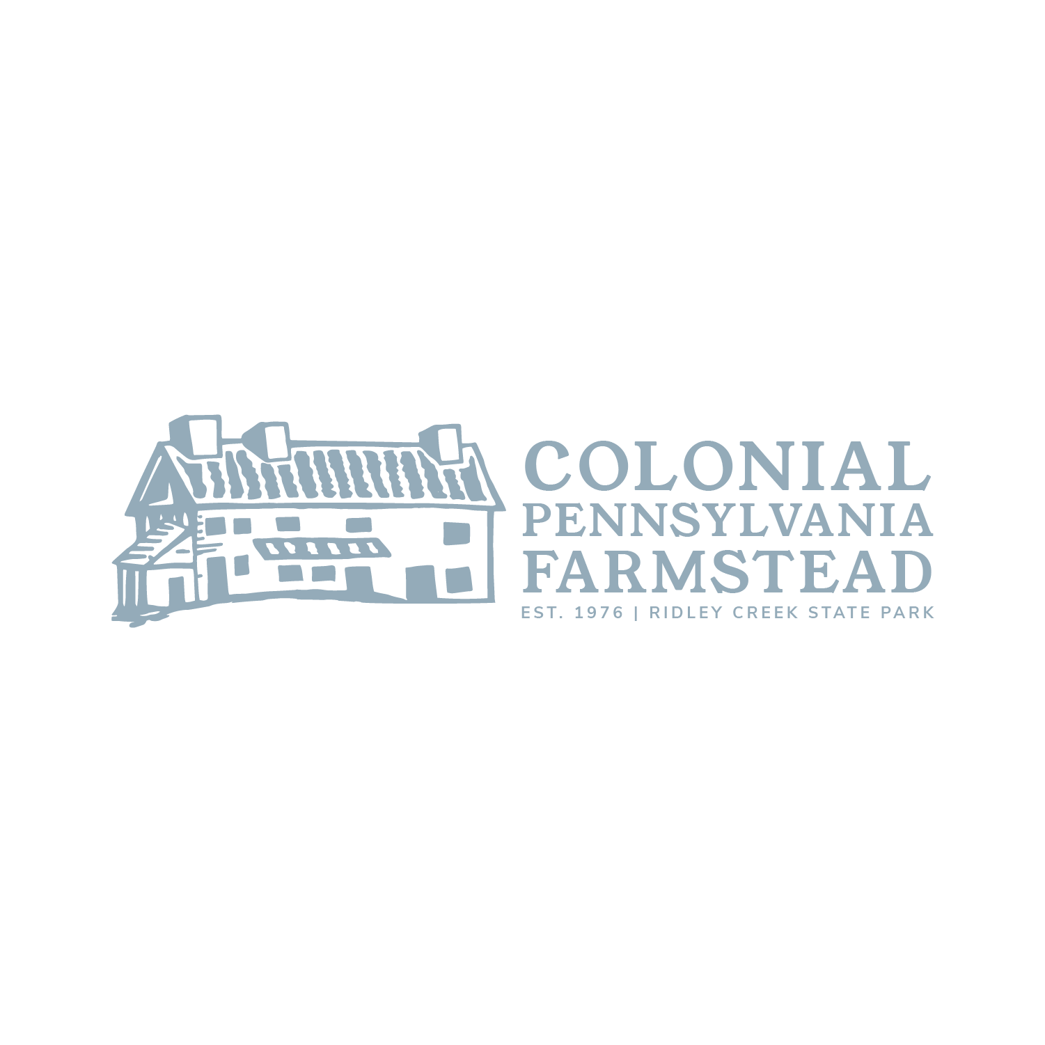
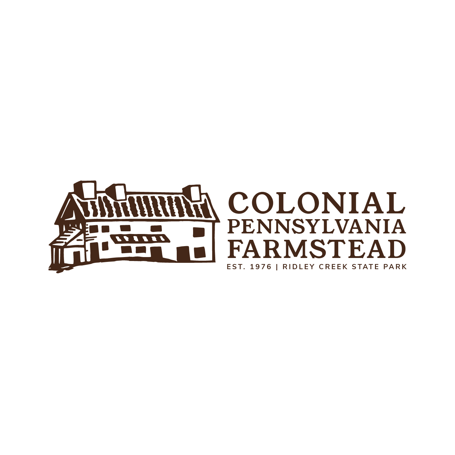
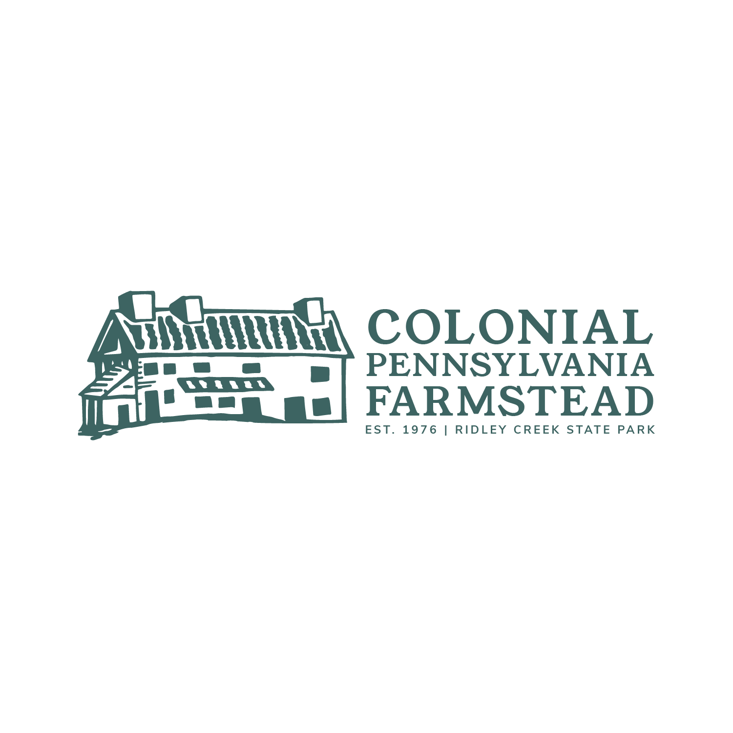
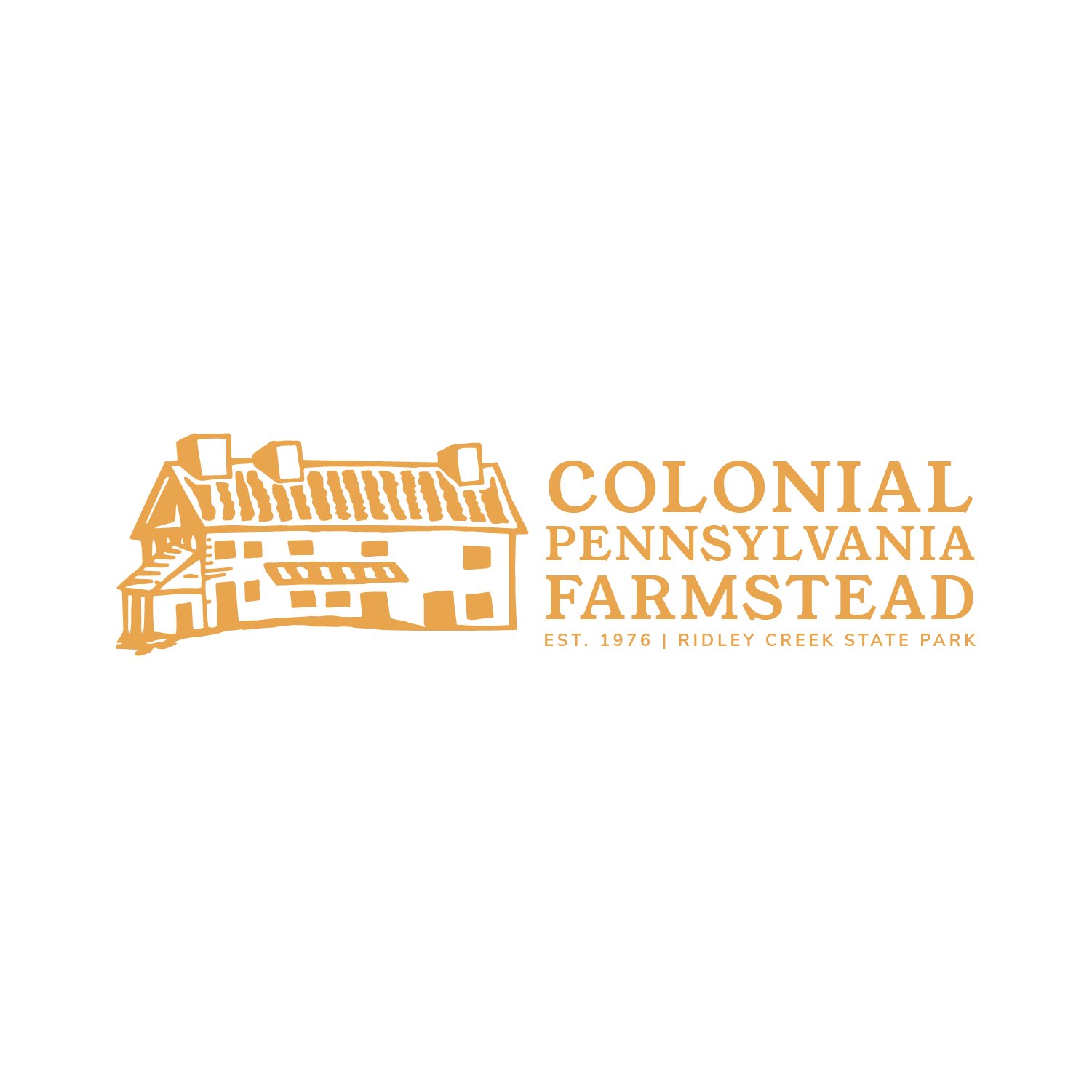
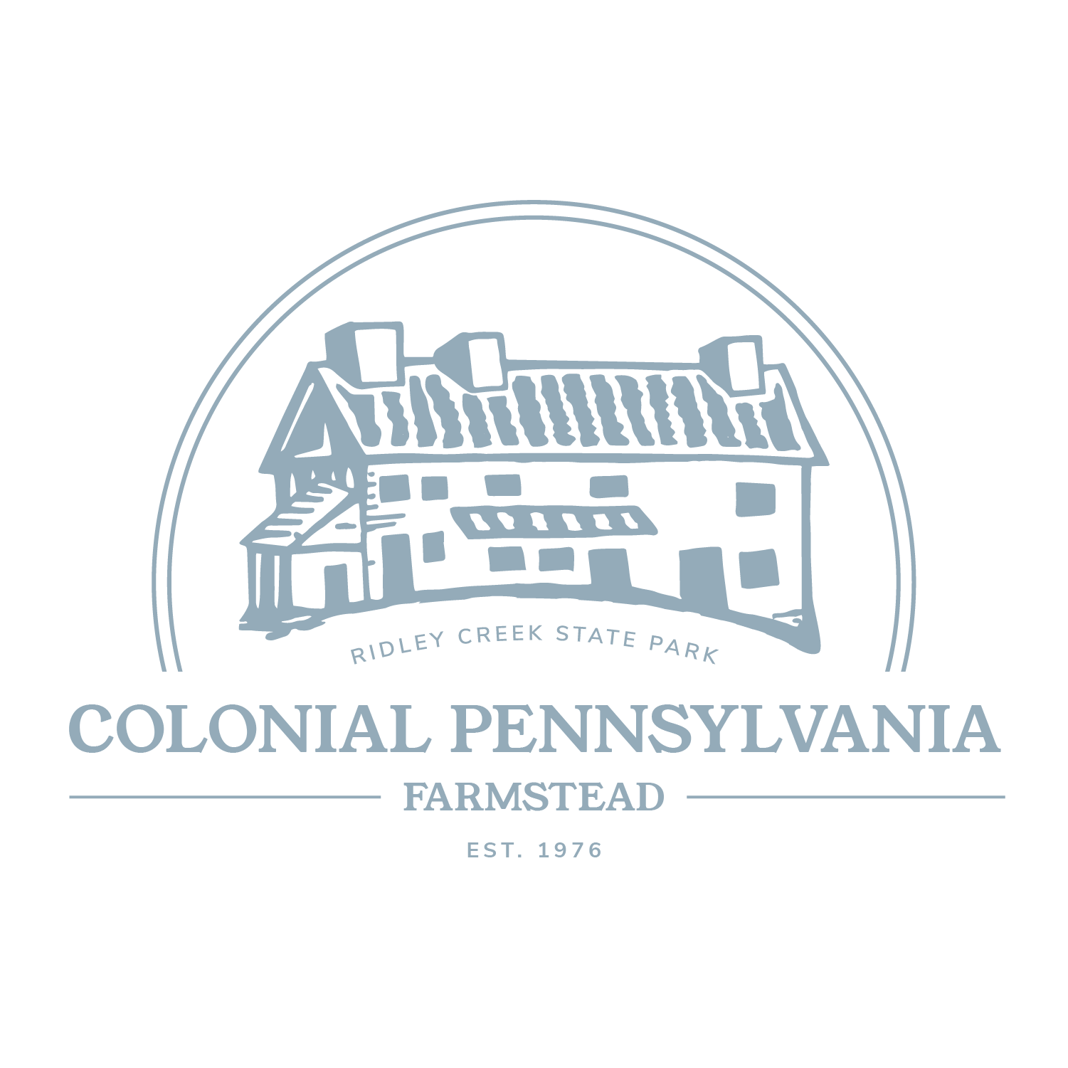
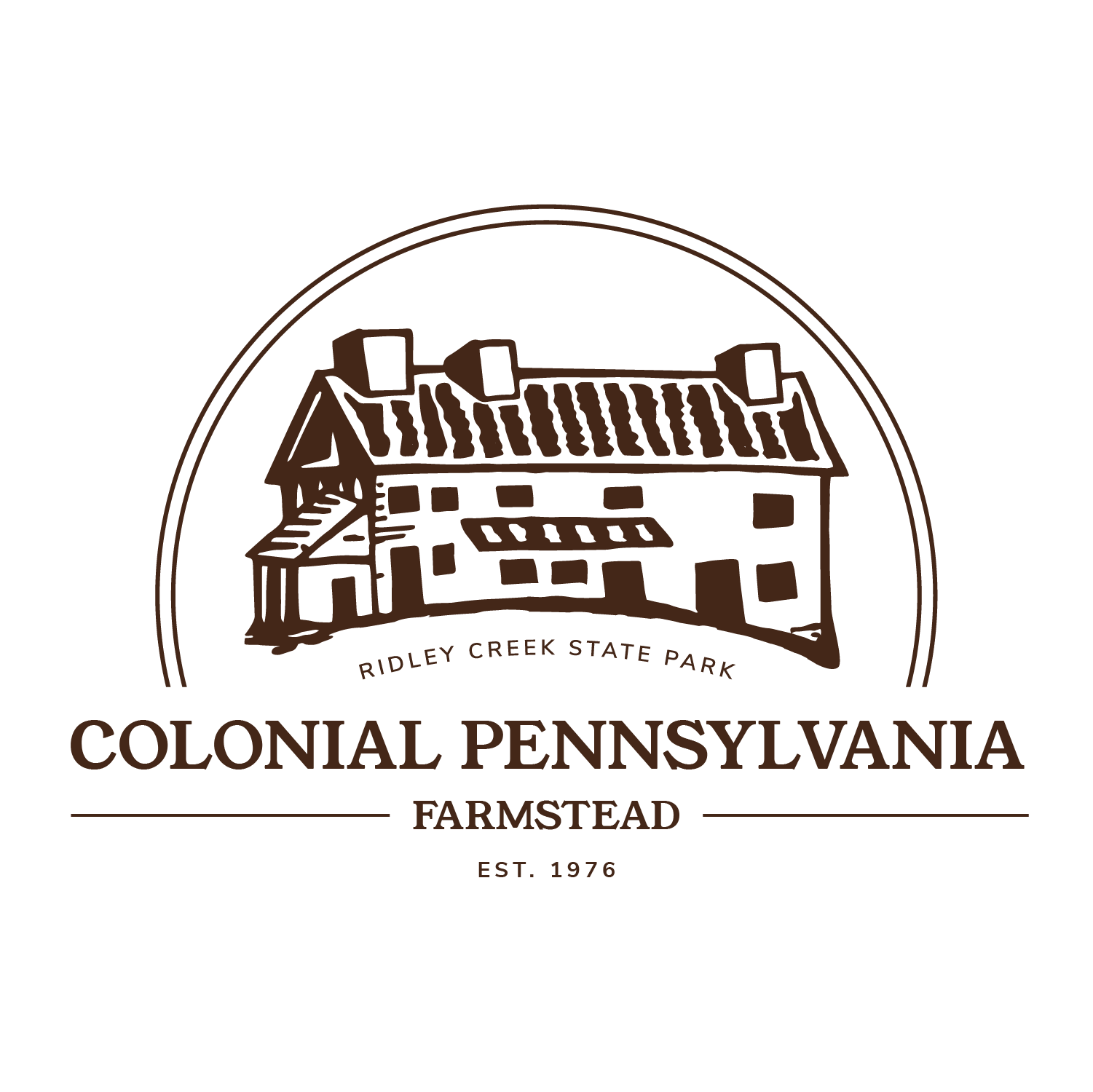
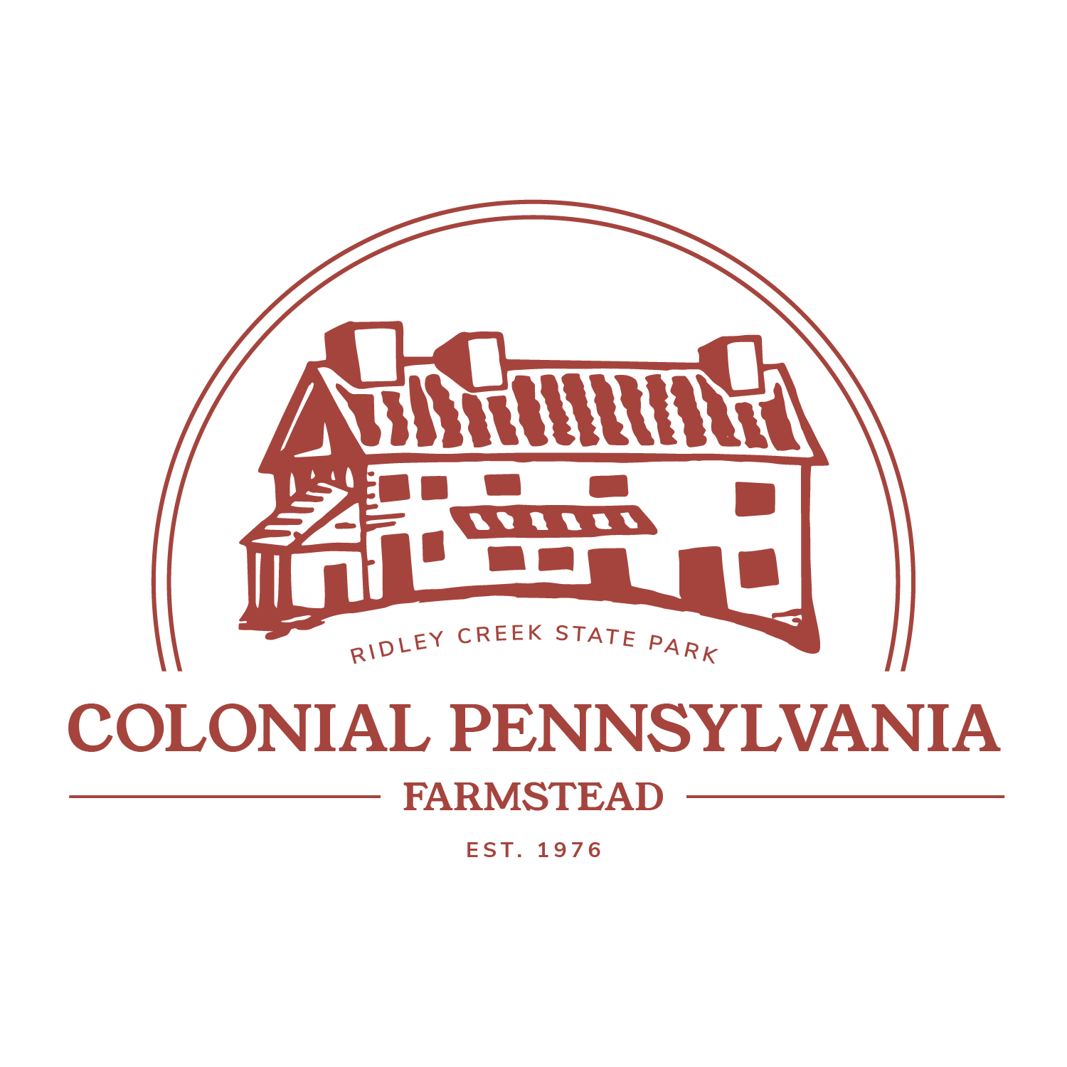
Ultimately, the client opted to retain a more refreshed logo rather than pursuing a complete redesign. This approach allowed Colonial Farmstead to update its visual identity while maintaining strong recognition with its existing audience. The home manor remained the central focus of the logo, reinforcing its importance as a defining symbol across their brand presence.
Below is the finalized primary logo.


50TH ANNIVERSARY LOGO
The farmstead was declared a historical site in 1976, as a part of the United States Bicentennial. While 2026 will be the 250th birthday of America, it will also be the 50th birthday of the Farmstead. To celebrate this milestone, the client sought a 50th anniversary logo that complemented the new logo.
I incorporated the iconic manor home within the number ‘50’ to keep a consistent look.

COLOR PALETTE
The farmstead had no previous color palette. To create consistency, the client sought a warm, organic feel to be implemented across the brand. I put together a palette rooted in the earthy, natural tones the farm evokes, while providing subtle pops of color, allowing the client to mix and match.